ordering factors by another column with R
Plot a clear ggplot2 bar chart with x-axis labels appearing in the frequency with which they occur in the data frame.
Data Sample
Suppose we have a sample of students who come from different countries. This gives us a data frame of student origins, and the number of students who come from each origin.
#sample of student origin in class
cc.df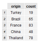
#plot is hard to interpret when origin ordered alphabetically
library(ggplot2)
country.count.plot <-
  ggplot(cc.df, aes(x=origin, y=count)) +
  geom_bar(stat="identity", colour="black", fill="white") +
  xlab("") + ylab("")

country.count.plot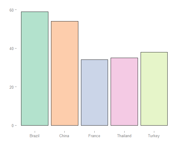
Solution (Up)
Using the reorder function we are able to order origin factor by ascending count.
#reorder origin by ascending count
cc.df$origin <- reorder(cc.df$origin, cc.df$count)

#plot is much more clear
country.count.plot <-
  ggplot(cc.df, aes(x=origin, y=count)) +
  geom_bar(stat="identity", colour="black", fill="white") +
  xlab("") + ylab("")

country.count.plot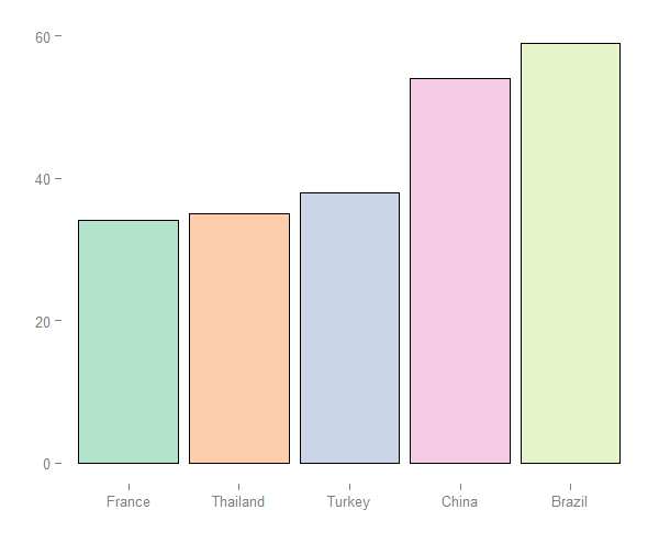
Solution (Down)
We can also order origin by descending count.
#order by descending count
cc.df$origin <- reorder(cc.df$origin, -cc.df$count)

#voila the plot I was looking for
country.count.plot <-
  ggplot(cc.df, aes(x=origin, y=count)) +
  geom_bar(stat="identity", colour="black", fill="white") +
  xlab("") + ylab("")

country.count.plot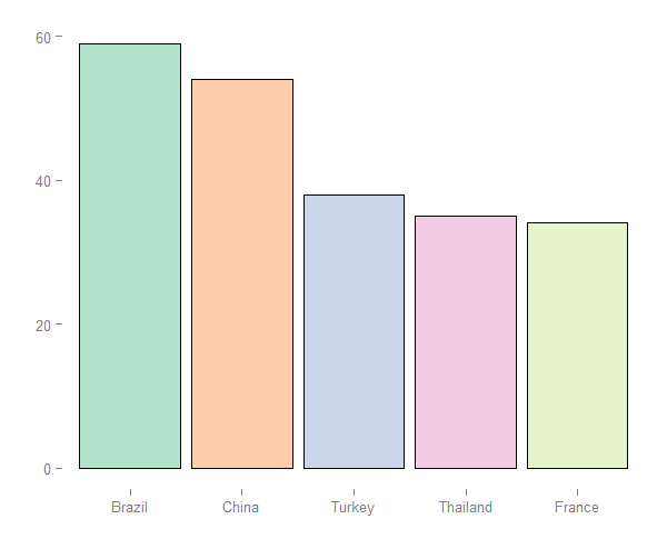
Feedback
Always feel free to get in touch with other solutions, general thoughts or questions.